WMS PACK STATION
Oracle NetSuite 2020
ABOUT THE DESIGN
The WMS Pack Station project was an effort spanning multiple release cycles. It was originally designed to be a feature to the native Oracle NetSuite Warehouse Management System and ended up also being a standalone solution that customers could integrate with their existing Warehouse Management Software.
MY ROLE
I was the Lead Designer, working tightly with a Director of WMS Product, two Product Managers, a UX Researcher, multiple Developers and a number of existing/potential customers.
It was my role to bring a design thinking approach to this project and implement best practices in regards to user research, design and testing.
THE PROBLEM
Our users were looking for a simplified way to maximize order and shipping accuracy.
The existing solution did not allow accountability for who packed what, and was extremely inefficient when it came to reviewing what items were being shipped in each package.
As well, this project was mandated to be an exemplar for proper UCD principles. We focused heavily on including members of PM and Dev in the process, and conducted an in-person design sprint to kick off the project.
OUR RESEARCH
We conducted a competitive analysis to assess the strengths and shortcomings of our competitors. Additionally, we engaged with customers to understand their needs and pain points, to better inform our product strategy.
We discovered that the majority of customers were currently using partner solutions to fill the Oracle NetSuite WMS fulfillment process gap. This resulted in a loss of 200+ deals a year (millions of dollars in revenue) to these partnered solutions.
Ouch.
And for those customers not using partner solutions, the common theme with the current solution, was a lack of automation. Customers were forced to use paper driven, manual processes, and showed us a number of workarounds they relied on to make up for shortcomings in the legacy solution.
“I just assume that what the picker put in the bin is correct, and that’s what I pack into these cartons to be shipped out.” ~ Anonymous Packer
THE FUN PART! (EXPLORATION AND DESIGN)
With some coffee in hand, we kicked off our first brainstorming session.
We reviewed the requirements for the design that our Product Managers provided and focused on a couple key points:
Usability - allow a packer to pack multiple cartons at the same time, quickly and accurately
Performance - all scans and button actions should happen in less than 2 seconds
Validation - ensure that the correct items/quantities are being scanned into the cartons, this is the last quality check before shipping
Visibility - show which items have been scanned into each carton
Traceability - track each cartons contents for parcel compliance and replacements for lost cartons
Labeling - print customizable packing slips and labels for cartons and orders (no more guessing)
From there we started brainstorming the flow a user would go down to pack an item using the picking process as a guide. It was a step-by-step approach, that allowed users to focus on one task at a time and scan items whenever possible. Since our customers were already very familiar with the Picking Process, we thought it would be best to mimic that flow with the packing process.
USER FLOW

Now with the user flow created we could start to visualize the screens.
BRAINSTROM SESSION

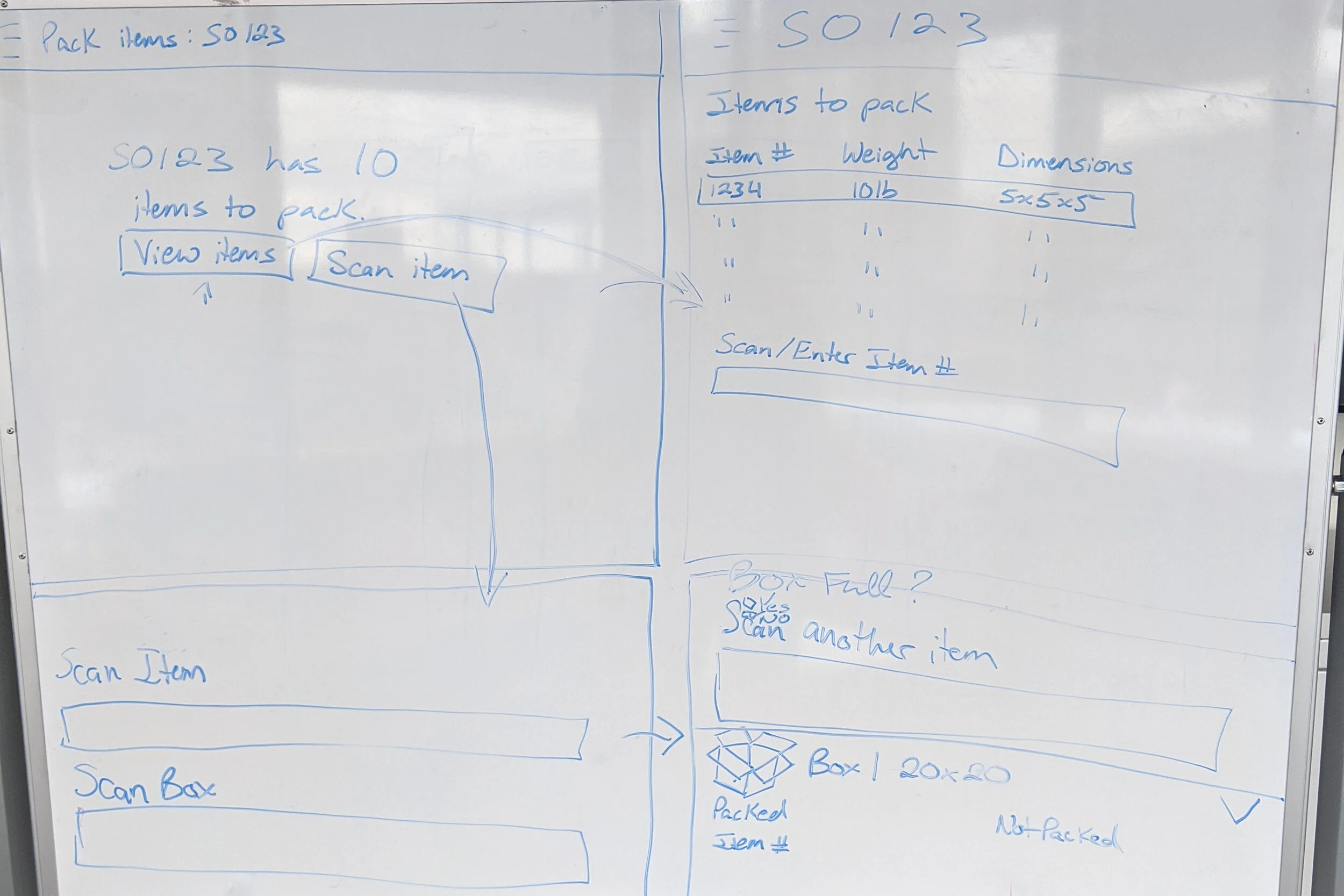
We played around with the concept of allowing users to view a packing list or to jump right into scanning items.
Keeping the same step-by-step approach used in our picking flows, we wanted to explore the idea of a user passing through multiple screens, that allowed users to focus on one task at a time.
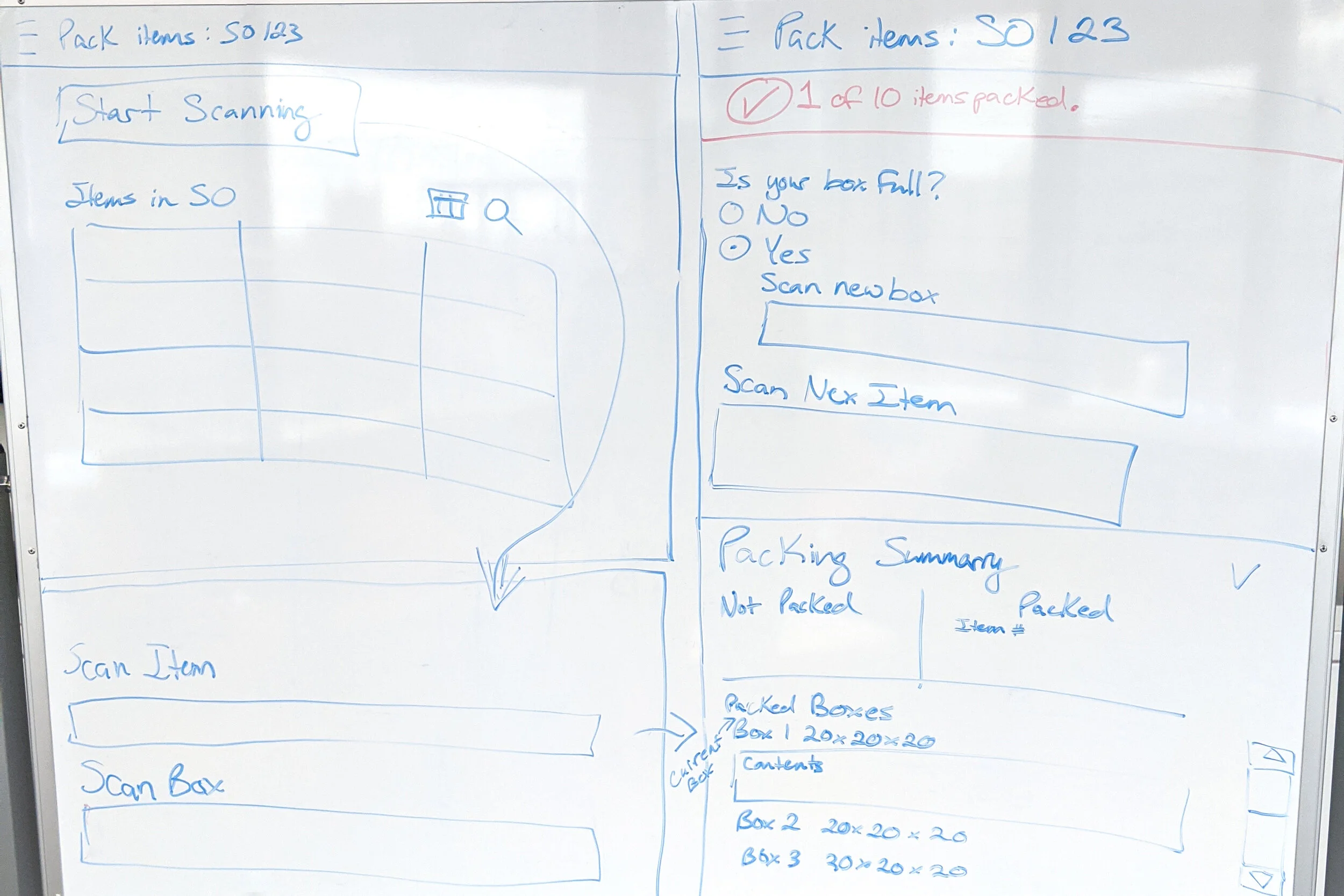
With seeing how many screens/scans/taps a user would have to go through, we started to become concerned that this would make a repetitive task feel even longer. So we went in a different direction and explored having one primary “packing screen” that would allow the user to see the packing list and items packed in the same screen.

We kept the layout similar to our current WMS Mobile Solution due to having a request to use already built components in our designs.
We were also told to design portrait first, as there was an assumption monitors would be displayed in that orientation. There was also the assumption that since we would be displaying long lists, a landscape orientation would not provide the best user experience. (We quickly squashed that assumption when our user research proved that most customers used their monitors in landscape orientation.)
Even though the above low-fi design was strongly preferred in the Director and PM’s eyes, when we demoed this design to our User Experience team, other concerns came to light.
Some designers questioned the preferred orientation especially for a 20” touch screen. There was confusion around the active box and what items are related to the box a user selected. Since tabbing through the box side menu, only impacted the lower right-hand table, designers were confused about what was changing. There needed to be more of a visual tie to the box selection and the item’s packed list.
We then wanted to validate those concerns brought up by our design team with our Subject Matter Experts. This panel of people consisted of sales representatives, customer service representatives, and retired Warehouse Managers, who interacted with our warehouse customers daily. Other than our direct customers, they were the second best team to talk to.
Their feedback mainly focused on edge cases of how to pack multiple orders together and dealing with partially picked orders, rather than the overall design of the packing screen. However, they were confused on how to select an item if they couldn’t scan it and what the shuttle arrows did. The overall design to them looked “okay”, and was “very similar to our mobile solution”. But it was clear the design didn’t have any “wow” factor.
DESIGN SPRINT
This lit a fire in me to go back to the drawing board and exhaust more ideas for this packing screen. I was able to convince our Director and Product Managers to allow me to run a design sprint, that would help us explore more ideas around the pack screen.
When planning the design sprint, I focused heavily on including members of PM and Dev in the process, to ensure the design ideas brought up would stay on track to what we were hoping to achieve. I also included net new designers and developers who didn’t know what the previous solutions looked like and how our competitors solved this problem.
Our end result was vastly different from the original design and definitely provided the wow factor.


We came up with a concept that allowed users to collapse the list of items remaining and provided a stronger visual tie to the selected cartons and the items inside of it. We also wanted to introduce barcode shortcuts that would allow the packer to not need to touch the interface at all.
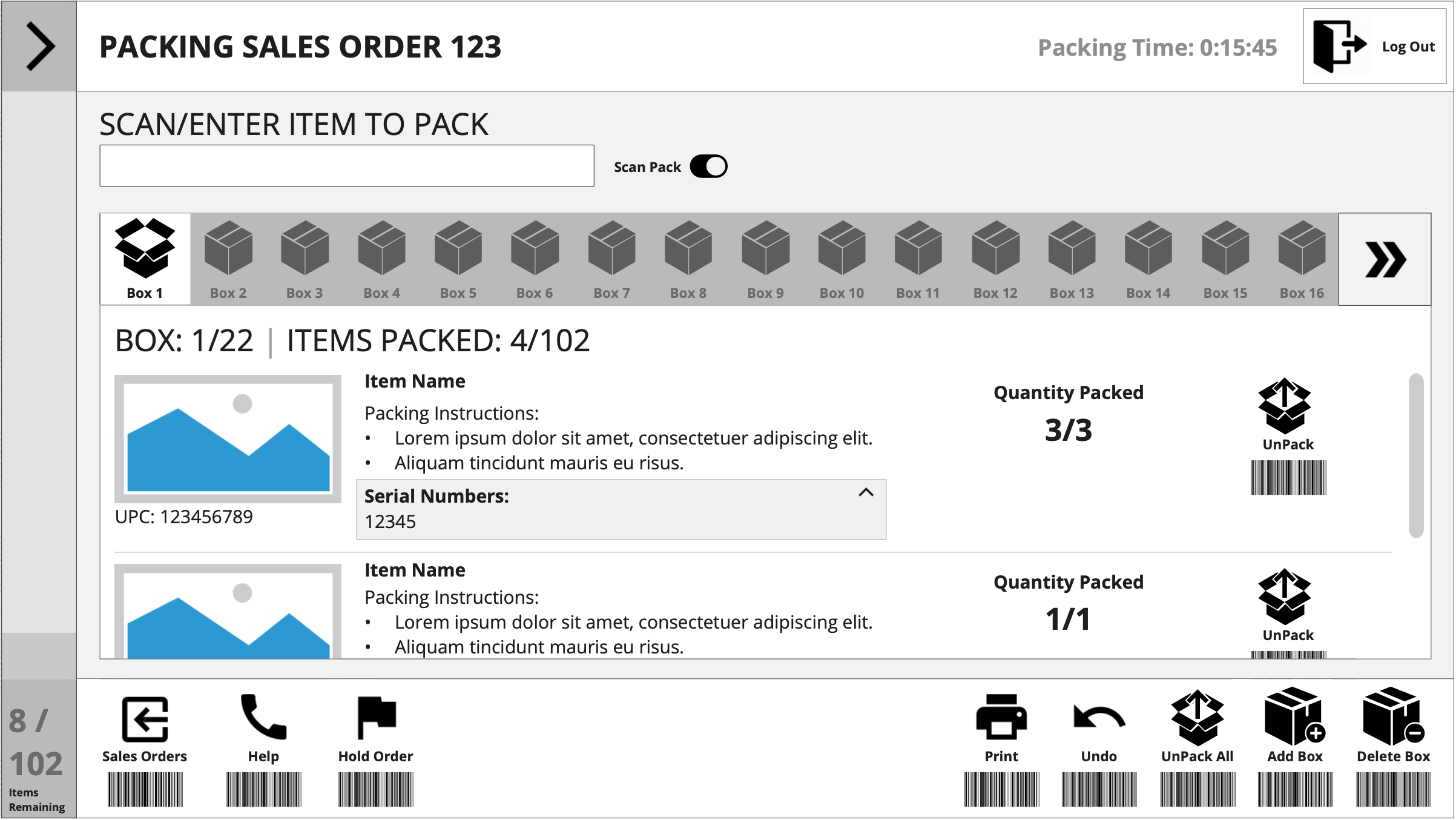
I then presented this design to the Director and Product Managers who explained that we weren't able to implement the barcodes on screen as most scan guns wouldn't read barcodes off of a screen. We were also challenged with the concept of having the packing list collapsible. According to our Director this was something most users would want to see at all times as well as the list of packed items. An idea was brought up about having both tables interact together, similar to the original concept, but to make it more clear that the packed items table was tied to the selected carton.
DESIGN MASSAGING
With this great directive feedback I was able to combine the original unorganized mockup with the new ideas dancing in my head.
The new design provided a better user experience as it showcased a visual hierarchy with components so a user knew where to start and end. It also provided a stronger tie to what items were placed in a selected carton which would aid the packer to continue accuracy and efficiency in the packing process. We also included clearer affordances so users understood that they could either scan or enter in item codes or if an item was unable to be scanned or a barcode was ripped or missing, a user would be able to tap the “Pack Item” button which would complete the same action.

USER TESTING
With our final design approved, and a couple of customer visits scheduled, we were able to prepare on-site user testing at our customer warehouses!
I knew we would only get this one opportunity to bring our idea to a customer and we wanted it to be executed flawlessly. We needed to show our solution in a prototype working form that customers could play with and we could perform exceptional user testing. This required me to quickly learn a new design program, Axure. By creating my prototype in Axure, I was able to create a live test environment that showed the inputs, logic, dynamic states and non-linear navigation that mimicked a coded solution. Our customers were able to interact with the prototype using a 20” touch screen monitor, a bluetooth numpad and a wireless RF-Scan gun.


Check out a recording of one of our test sessions:
KEY INSIGHTS
Overall, the reception to our Packing solution was incredibly positive and we were able to identify a few additional suggestions for improvement; auditory feedback, visual cues for a “ship as item”, a virtual keyboard to completely eliminate the need for a mouse and keyboard, and having a dark mode option.
These insights were able to be incorporated into the final design and allowed us to confidently release a product to market that we know will be well received.
“When we pay more attention to our customer than our competition, the customer pays more attention to us.”

